Monday, May 02, 2011

'ZINE' Project Finally COMPLETE!

Some (most) students have FINALS this week, but as a Graphics Design major, I and my fellow design majors have FINAL PROJECTS.  Today, I turned in one of those final projects and am relieved to be done.  It's been a long semester but a very interesting one.  And I've enjoyed every minute of it.

My final project for my Intro to Graphic Design class was to create a 'ZINE,' that is a 'How-To' booklet of sorts.  I chose to create an instructional booklet on 'How to Create a Scrapbook Quilt Block.'  My inspiration came from a project I did a few years back when I created a full-size bed quilt for my mother containing over 200 various family photos.  I enjoyed the project so much that I felt it would be a good topic to discuss in my 'Zine' project.

While my children were babies at home, I watched a LOT of HGTV and the craft shows there.  One in particular featured a lady named Ami Simms who has designed and written a book called 'Creating Scrapbook Quilts.'  She is one talented lady!  A VERY talented seamstress turned artist (or perhaps the other way around) to say the least.  A great influence to those of us interested in scrapbook quilting.  She has her own website that features several creative quilting projects, but my favorites are the scrapbook quilts.  Please take a look at her work here:  AmiSimms.com  and her book  'Creating Scrapbook Quilts' is where I learned how to create my own scrapbook quilt projects.  Here is a link to some of Ami's own quilt projects which have been a great inspiration to me:  Ami's Quilts  as well as her follower's photo quilt projects.

Also, there is a wonderful product on the market for quilters/artist to easily incorporate their own photos and works of art into their projects.  It's called 'Inkjet Printable Fabric' and all you have to do is scan in your photos (or other artwork) and then print it out onto this printable fabric (it's like muslin fabric with a paper backing to work with your printer easily).  Then you just soak it in cold water and iron it to set the ink before sewing it into your project!  It's really very easy and LOTS of FUN!

Here are some photos of my final ZINE project which I turned in today.  The final size of my booklet is 5-1/2" x 5-1/2" sq.  I chose this particular size as it was easy to work with in creating my quilt block book cover (and yes, that is an actual quilt block and NOT just a Photoshop image printed onto paper).  Also, the project assignment instructions suggested it would be more convenient to create our booklets in a small size to allow for easier re-producing and handling.  The project was to re-produce copies easily, that is the reason for the second cover version.  The same booklet, just with a different fabric block look.  Once the fabric quilt block cover was complete, I mounted it with spray adhesive onto a 5-1/2" x 5-1/2" piece of mat board for stability (as well as the back cover, which is just a solid piece of fabric sewn to the front cover).  I then printed out each page to insert, cutting to size and then carefully scoring in the center of each page to make folding easier, as the pages are printed on card stock paper.  I then printed the front/back inside covers on a similar card stock paper.  I used spray adhesive once again to mount the front/back inside card stock covers to the inside of the fabric covers before inserting the pages themselves.  To bind the pages together, I used a simple saddle stitch method using binders thread.  There are other more sophisticated methods of binding a book together, but since I had so few pages to my book, this was the most logical method to use, I thought.

It was a very FUN project and easy to do, just time consuming if you've never created one before.  If you're interested in making your own, please let me know.  I'd be happy to try and explain it in greater detail for you and send better instructions!  I hope you will enjoy and please be sure to let me know what you think!


Front Cover
(version #1 & #2)

Pgs 2&3
Pgs 4&5


Pgs 6&7


Pg 8&Back Cover


As the 2011 spring semester comes to a close, so do all my Intro to Graphic Design projects.  I've enjoyed each and every one of them immensely.  I look forward now to the upcoming summer courses I will be taking:  Digital Studio, Intro to Adobe Creative Suite and History of Graphic Design.  I also look forward to more challenging courses in the fall such as Publication Design and Package Design.  Always a challenge in this field and I look forward to it all.  Thank you for keeping up with me this semester.  I will post my Typography class projects soon, too and continue to try and show as much work as I can of upcoming class projects as well, so please continue to check back as often as you can.

Thank you
--Kim

Tuesday, April 12, 2011

How To 'Zine' Project--FINAL Project of the Semester

    Our next and FINAL project of the semester for Intro to Graphic Design is to produce a 'zine' that is a 'How To...' instructional guide.  We are to use text and illustration.  Use graphical devices that support communication in instructional design.  No printed color will be allowed but rather color in materials or alternative coloring techniques.  We are to use a non-book insert within our 'zine' and an appropriate binding technique to our project.   The format and scale of the final product will suit the content.  

My 'zine' of choice will be 'How to Make A Quilt Block.'  I'm still deciding on the particular type of quilt block, the look and feel overall of the project, so more information is yet to come. 

What is a 'ZINE?'  A 'zine' is an informal hand-made magazine.  'Zines' are usually produced in short runs and given out for FREE or traded rather than sold.  Their content is often personal, artistic, and anything other than what is found in mainstream commercial magazines.  The format and materials used in the 'zine' are often as creative as the content.

More to come....please check back SOON!

Take a look at my final INFOGRAPH:

    Well, this project I must say has been my most challenging so far.  And I'm still not sure why?  None-the-less, here is my FINAL Infograph.
    The INFOGRAPHIC project is one where we had to gather information from some aspect of our daily lives and put it into an 11x17 poster that includes some form of graph, images and text to visually portray the data.  I chose to explore the ever rising expenses of my commute to & from campus.  As GAS PRICES continue to SWELL out of control, so does the cost of my commute!  Take a look:

Tuesday, March 29, 2011

Next Project: InfoGraphics


Following are some rather interesting examples of INFOGRAPHICS I've chosen to study for possible ideas for my next project.  Take a look....they're all quite interesting!

Here's a pretty creative Infograph on the NEW generation of iPhones to com

http://www.coolinfographics.com/


Great Coffee Infographics!


Why Do Freeways Come To A Stop?


GE (my favorite interactive infographic)


Credit Report


Pepto Bismol


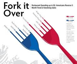
Fork it Over


psfk Home Stickers


psfk Home Stickers


All About Nintendo

30 Great Examples of InfoGraphics

Sunday, March 27, 2011

Final 'Farm-fresh Eggs' PSA:

With much trial and tribulation, working and re-working my organic eggs PSA, I think I have finally come to a definite END to this project!  I'm posting it below, good or bad, it is done.  I'm turing it in tomorrow and am glad of it.  Feel free to still give me your comments, but it is what it is.  Not making changes now.  Thanks for everyone's input--I've appreciated all of your support and interest in my projects, especially this one. Thanks again and please take a look and don't forget to leave your comments below before you leave!

FINAL Version:  no matter what! ;)

With an abundance of eliminations of some pretty good ideas (I must admit), I've finally reached the end of my 'Organic Eggs' PSA journey for my Intro to Graphic Design class.  My instructor was gracious enough to allow me to 'tidy things up a bit' over spring break (thanks so much) and without his help I would have not been able to narrow it down as well as it is.
      The theme, by now I'm sure you've guessed, is 'Farm-fresh, Organic Eggs.'  My 11x17 Public Service Ad (PSA) is designed simply to allow the consumer to consider a healthier alternative of purchasing organic, farm-fresh eggs over the typical supermarket brands.  Although my ad does not go into great detail explaining why, it is direct and to the point in hopes that the consumer is interested enough to do their own research.  Research in hopes that they will find reasons why they should choose organic and farm-fresh produced eggs from 'free-range or cage-free chickens' which are organically fed and drug-free, rather than commercially grown, mass produced farm chickens; which are typically what we purchase in our local grocers.

      The inspiration for my ad came from an article in an old July 1954 issue of  'Better Homes and Gardens' magazine entitled 'What You Should Know About Eggs,' pg. 97.  Even back almost 60 years ago people began to understand the importance of eating healthier.  My creative inspirations came from not only this article (and artwork in general found in various magazine articles throughout 1954 'Better Homes and Gardens' issues), but also from incredible nostalgic poster art found on allposters.com entitled 'Barnyard Poultry Farm Eggs' 400x400dpi and  'Healthy Poultry Fresh Eggs' 400x400dpi.  Other inspiration came from an article found on motherearthnews.com entitled 'Meet Real Free-Range Eggs.'  The photograph taken of the eggs, both food art and the word 'eggs' written in egg yolk is by yours truly.


As always, I welcome your comments, criticisms or praise!  Please let me know your thoughts, whatever your opinion, please give it to me honestly.  This is how I grow creatively. YOU are the typical consumer, so who should know better than YOU if this ad would actually work in the real world?  

Thanks again for the feedback and please keep checking in often.  Updates are made at least weekly and I'm always open to suggestions.
      Thanks for stopping by!
            ~Kim

Thursday, March 24, 2011

MORE Revisions Yet to Come!

Please check back later this weekend.  Hopefully my FINAL will be FINAL....has to be....this baby is due first thing Monday morning!  Thanks everyone for your input.  It has really been most helpful this evening.

Revision:

Ok, some of you have already expressed a very valid concern to bacon frying in a pan AND the word 'HEALTHY' in the same add.  Ha!!  Yes, that doesn't seem quite right does it?  I'm not necessarily expressing HEALTHY eating as much as HEALTHIER CHICKENS producing ORGANIC FARM EGGS (am I splitting hairs here?  Well, that is my message), so hopefully this solution to the problem has helped clear that up a little bit.  Tell me if this works.  Appreciate the insight...you know sometimes you can't see the forest for the trees! ha  That's why it's good to bounce things off of YOU!!  Thanks.

Final version......YET?

"Farm-fresh Eggs"


Monday, March 14, 2011

PSA Assignment: 'Eat Healthy ... Eat Organic'

Well, here's the first post of my PSA poster entitled: 'Eat Healthy....Eat Organic.'  Please give me some feedback as it is due THIS WEDNESDAY, March 16th!  Thanks.

Monday, March 07, 2011

My Picasa Album Link

My Picasa Web Album is finally HERE!  Please go take a look and tell me what you think (updates all the time so keep checking back)....
Kim's Graphic Design

Sunday, March 06, 2011

Getting there.....

  Well, it's slowly getting there.  I work on it little by little and hopefully someday soon will have all the bugs worked out on my blog site.  Thanks for being patient everyone and be sure to let me know what you think of not only my latest class project (listed below) but the NEW LOOK to my blog!  Be sure to 'click around' for hidden links, too.  Some I'm getting connected ok and some still having some troubles, but I hope to figure them all out real soon.  For example, if you can get to my other website from here (I'm also an Independent Consultant for Silpada Designs Fine Sterling Silver Jewelry), I know I've done at least one link right.  I'm still working on some of the others though.  (Oh, and let me know if you want to order anything from Silpada, too).
  As always, thanks for stopping by and your comments are always welcome.

Friday, March 04, 2011

PUBLIC SERVICE AD Project

    I have two (2) possible ideas for my current project and I'm leaning toward the latter, if I can make it work.  First idea is 'Eggs--Healthy, Organic, a 'Good for You Food.'  Another idea however, is 'Automobiles--Buy American Made.'

Theme photos for each~

Organic Eggs Ad:


 1940-50's feel.

Buy American Made ad:


Background/screen tint.  1930-50's feel.

Research continues at the library this week and final ideas coming very soon, so keep checking back.  

Monday, February 21, 2011

MY LETTER PROJECT: FINALLY DONE AND TURNED IN!!

Soooo, my FINAL Letter Name Project is finally DONE and here are the results....I turned in not one but 2 (two) versions of my final project because I just couldn't make up my mind!  We'll see how that goes.  Although the final images here are shown on a black background, I ended up printing each of them onto 12x12 Scrapbook card stock paper, both cream and 'grocery paper sack' brown.  Both turned out very nicely; crisp, clean.

Thanks again everyone for your comments and support, and a special thanks to those who helped me on this fun project!


This is the Alternative DEsiGn....I pushed the original look over the edge just a bit in Photoshop......


.....and here's the more Traditional DEsiGn.....kept my photos as simple and clean as possible.  

Feedback is always appreciated and very helpful.  Thanks too looking!

Kim

Tuesday, February 08, 2011

FINAL Letters from Letter Project:

Ver. #1
Ver. #2

K - Created as a quilt 'block' project on a quilt background. Version #2 Photoshop Sepia tone and spot color effect.
Ver. #1
Ver. #2

I - Created with an Cookie Dough & Cookie Cutters. Version #2 Photoshop Neon Glow effect.

Ver. #1
Ver. #2

M - Created from Hershey's Chocolate Kisses.  Version #2 Photoshop take out colors effects.

Ver. #1
Ver. #2

F - Built out of LEGOS.  Version #2 Photoshop Plastic Wrap effect.

Ver. #1
Vers. #2

R - Created out of lots of Valentine candies.  Version #2 Photoshop Texture on Canvas effect.

Ver. #1
Ver. #2

A - Created using an old apron pattern and sewing materials.  Version #2 Photoshop Sepia tone with spot color.
Ver. #1
Ver. #2

N - Created using fruit roll-ups. Version #2 Texture Grain effect and colors taken out.

Ver. #1
Ver. #2

C - Created using guitar picks.  Version #2 Watercolor effect.

Ver. #1
Ver. #2

I - Created from an iPhone and iPods.  Version #2 Photoshop spot color on b/w.

Ver. #1
Ver. #2

S - Created from lots of beautiful jewelry.  Version #2 Photoshop Dry Brush effect.

It was FUN -- thanks again everyone!